Cromwell Sanchez
Product Design
Case study:
- Rental management
Olgood is an improved service that helps users organizing and managing the rental of a property.
UX CASE STUDY

People have a hard time organizing and managing a rental process. One of the main problem focuses on the time they spend in the search and the administrative phase.
Everything start with a simple question.
”How might we design a service for homeowners and tenants that considers and facilitates the administrative difficulties of renting?”
problem_Statement
Initial question statement
Cromwell Sanchez
In this phase of the process I try to answer some key questions wich will help to develop the project and have deeper resolution about the assumptions I’ve got during this project and know the users.
Who is involved?
What kind of data should I collect?
What are the alternatives?
What do the users want to achieve with this?
What’s the biggest risk?
Where was it resolved before?
Why do they need this?
How do they will know this solution?
Why is the problem important?
How could this problem be an opportunity?
Why does it occur?
How could it be solve?
Why was it not yet solved?
What has already been tried to resolve the problem?
Why the solution isn’t a new added frustration?
TakeOff_
5 W + H
designThinking_Process
Empathize
Define
Ideate
Prototype
Test
Usability & A/B testing
Figma Prototype & Mockups
Benchmarking
Exploratory surveys
Primary & secondary research
deliverables_
Tools used
User journey map, flow & persona
Figma
Maze

Useberry
Miro
Google docs & forms
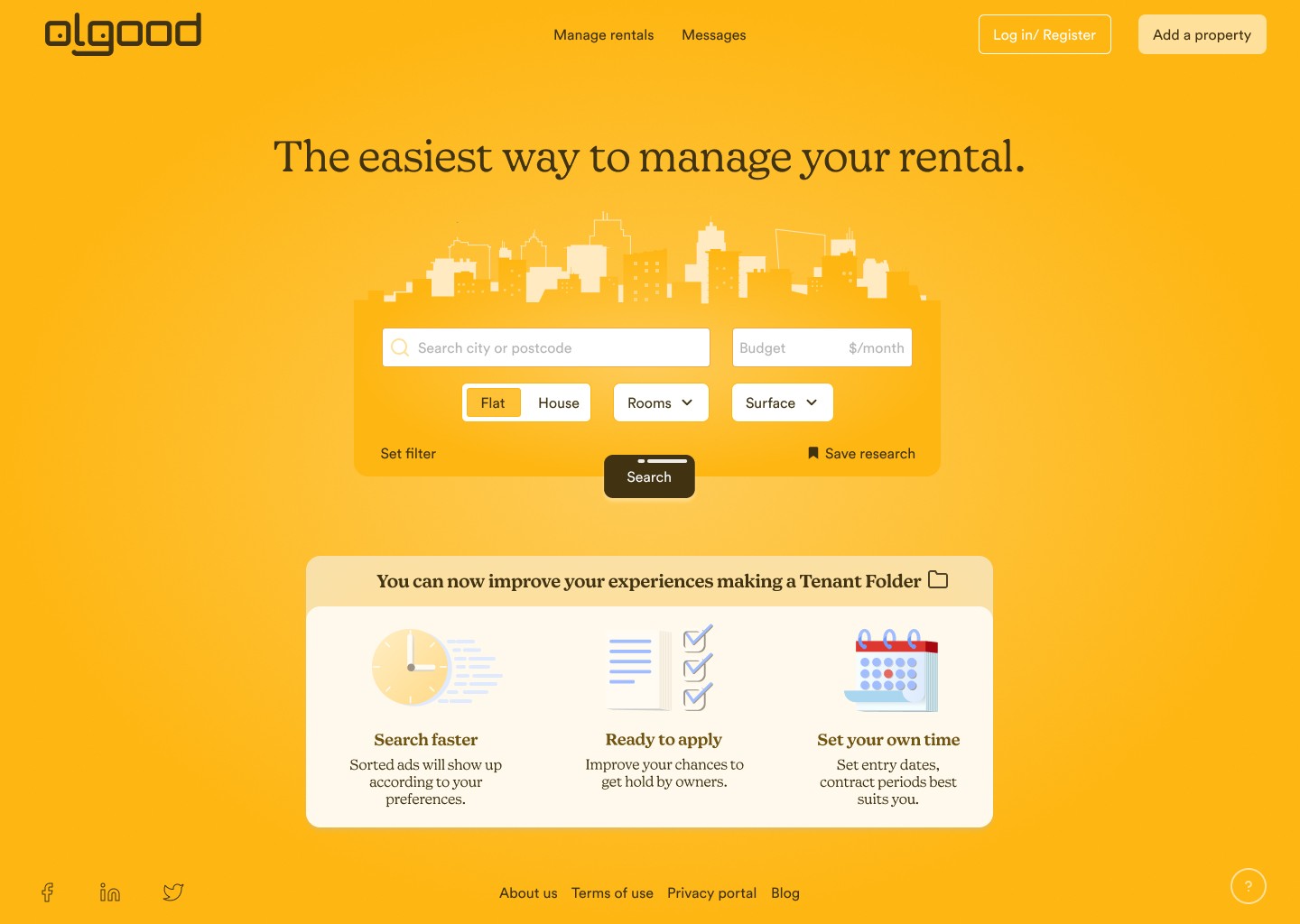
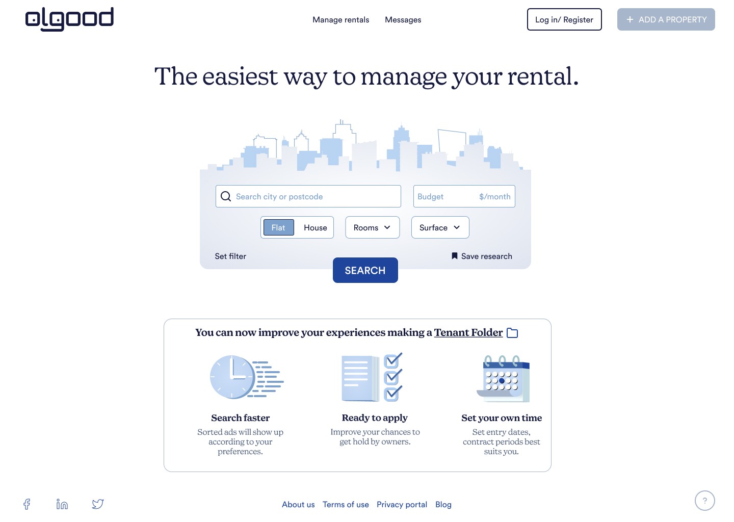
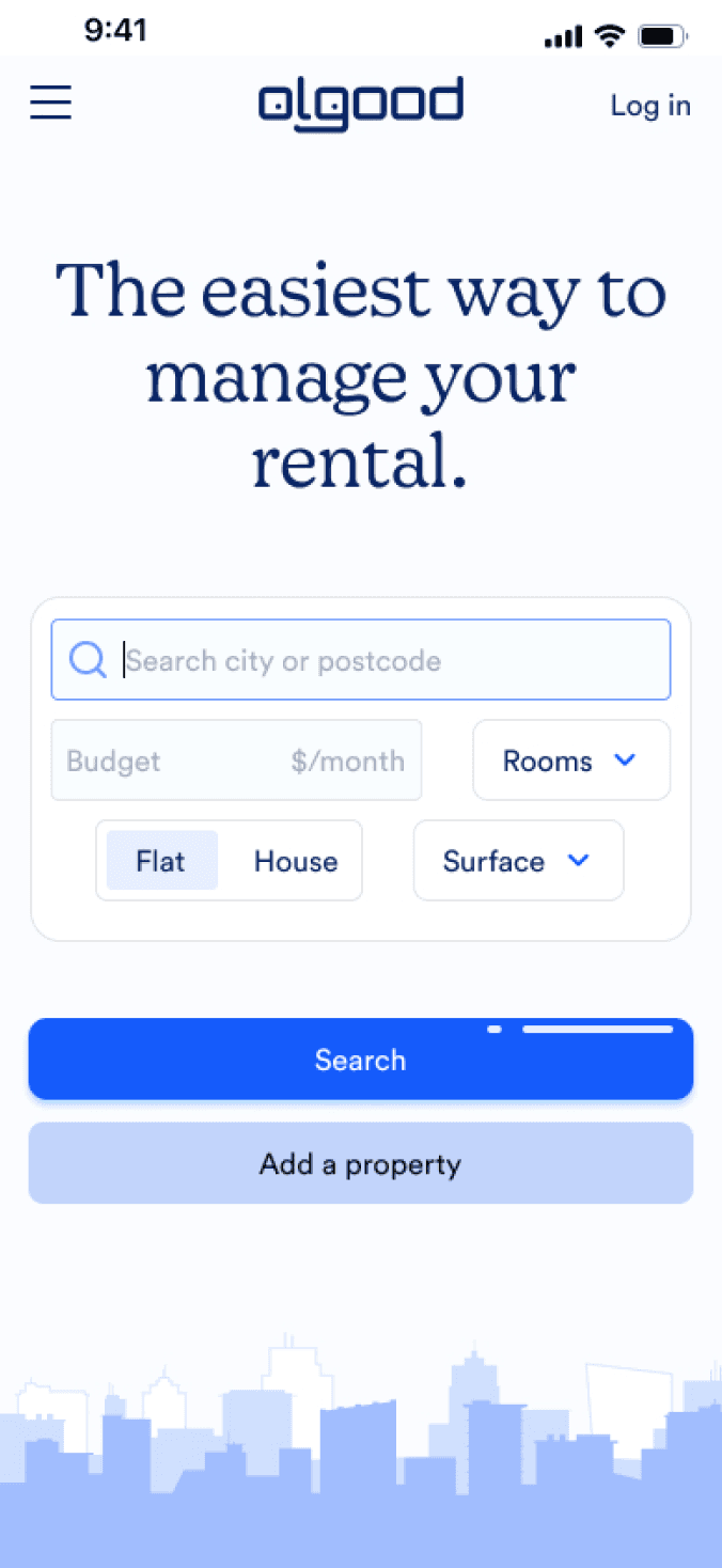
Olgood
Project briefing
Olgood is an improved service for rental purposes which will help users to organize and manage the interaction between owners and tenants for non-vacation places, making the organization process smoother and straight.
briefing_
Most people have already faced the experience of having to search a rent where they wish to move in. For some people can become a little job in their everyday life since it is not just searching for the right one but also getting hold with the minimum requirements asked by landlords. Since modern technologies make rental search experience easy and fast, we can still improve how users or customers may organize his/her rental .
Objective of the project
empathize
Exploratory survey
Primary research
Secondary research
Benchmarking
Cromwell Sanchez
Empathize
Define
Ideate
Prototype
Test
Olgood
Follow up questions for: gender, location, occupation, device, internet access.
When you've needed to rent a property, what product/app/service did you use?
Was it hard to use it? Why?
What did you like it? Why?
Either you were a tenant or a homeowner, what was the hardest thing of the process of renting?
What could have made it easier?
Either you were 'Homeowner' or 'Tenant', Did they ask you / Did you ask them for referrals or guarantees?
As a Tenant, how many referrals did you need to hand over? In which way did you give them?
As a Homeowner, what is/are the most important requirement/s you ask?
Where do you stock the referrals you need to show to the owner?
How long does it take you to find/rent the property?
How many papers were handed over in that case?
Which ones (guarantees) were the most demanded?
In which way did you hand them over?
exploratory_Survey
This is one of the first steps after listing the main and initial assumptions about the service and users. This will help us to get some insight and split up the answers in opportunities and frustrations. We try to construct questions that will also help us undertand the users in differents aspects.
We split the exploratory survey in two branches: qualitatives, where we approach more often to the user with ‘why’ questions for problems and needs. Finally, questions that’ll gather quantitatives data where we’ll use along our secondary research.
Cromwell Sanchez
Olgood
Empathize
Define
Ideate
Prototype
Test
Cromwell Sanchez
primary & secondary_Research
I’ve conducted exploratory surveys online.
The answers showed us the follow (from 9 participants):
Most of them were students as the role of tenants.
The survey also is done by a majority of women.
The device most used by users is the smartphone.
People need minimum about 2 weeks - 3 months to find the apartment.
Storing papers could be either physically in paper, smartphone or PC.
For some, we’ve got many types of demanded papers: ID, payslips, a contract, tax return paper, proof of residence, housing insurance…
Users do research on google for a specific web or app.
The period of time which participants rented a place out goes from 2018 to 2022.
Quantitative research outcome:

Olgood
Empathize
Define
Ideate
Prototype
Test
benchmarking_
Leboncoin is the most visited website but their main target business is an online ecommerce between individuals. Otherwise, the main competitors would be sites such as: Ebay, Cdiscount, paruvendu.fr.
Why are we picking this site for our research? Because research shows that most people in France use the site for selling or buying goods but also to rent out a property. To the point that this website provides a service similar to what we are building.
Clarifications:

Company
They ask the users to add “when” they want to move out and “how long” as well. It’s proposed more intuitive from the beginning of the rent research but you’ll need to make a profile.
The service differences
Men
By gender
137
Total visits (millions)
+++++
Popularity
Sells goods
Type
Leboncoin
Sites (French market)
Cromwell Sanchez
document_Workflow
It is important to know the way users manage and deliver their documentation so we can better understand the process they go through when searching a property. Most homeowners ask some documentation in order to let people get in their properties. These documents are a guarantee mostly for any inconvenient may arise during tenant’s stay.

Cromwell Sanchez
How and what users currently collect documents?
How long does it take?
What channels does users use to collect documentation?
How & What user currently manage documents?
What channels does your business use to manage documentation?
What channels does your business use to deliver documents?
Olgood
Empathize
Define
Ideate
Prototype
Test
define
Affinity map
Personas
Journey map
Cromwell Sanchez
Empathize
Define
Ideate
Prototype
Test
Olgood
affinity_Map
User needs:
Owners can check applicants' profile when applied.
Incorporate chat system.
We give guidelines to complete the ad.
Recommendation to owners for virtual visit.
Tenants will have a profile completed with papers, ready to send.
Pain points:
Owners ask to send papers before visits.
Communication is difficult with owners.
Descriptions lack information.
Only phone calling available.
Not enough photos.
Renting takes time.
Horrible aesthetics.
Virtual tours aren't available.
Can't gather information in one app.
Qualitative data from the user survey has been gathered, I mapped them and organize them in different categories according to the insights I got from the users.
Opportunities:
Virtual visits.
Wished to have access to all the information in an app instead of surfing on internet.
Comments from previous tenants.
Guarantees.
Arrange/ Book online appointments.
Ad filtration “location, price, contact”.
Already written ad.
Suggestions:
Way to get the deposit as it was in the initial state.
Mechanism to distinguish between fake ads or real ones.
Only phone calling was available. Live chat was preferred.
Good aesthetics.
Make virtual tours available.
Free service.
Cromwell Sanchez
Olgood
Empathize
Define
Ideate
Prototype
Test
persona
I’ve created Personas in order to understand user’s goals, what they want to achieve but most importantly, why? I mainly got four types of Personas from the research. Even though I’ve got four personas, three of them will be identified as one since the product I am dealing with in this project is about offer and demand so homeowners and tenants. Those extra personas are nonetheless still very important because of the insights I get in order to design an accurate service.
Cromwell Sanchez

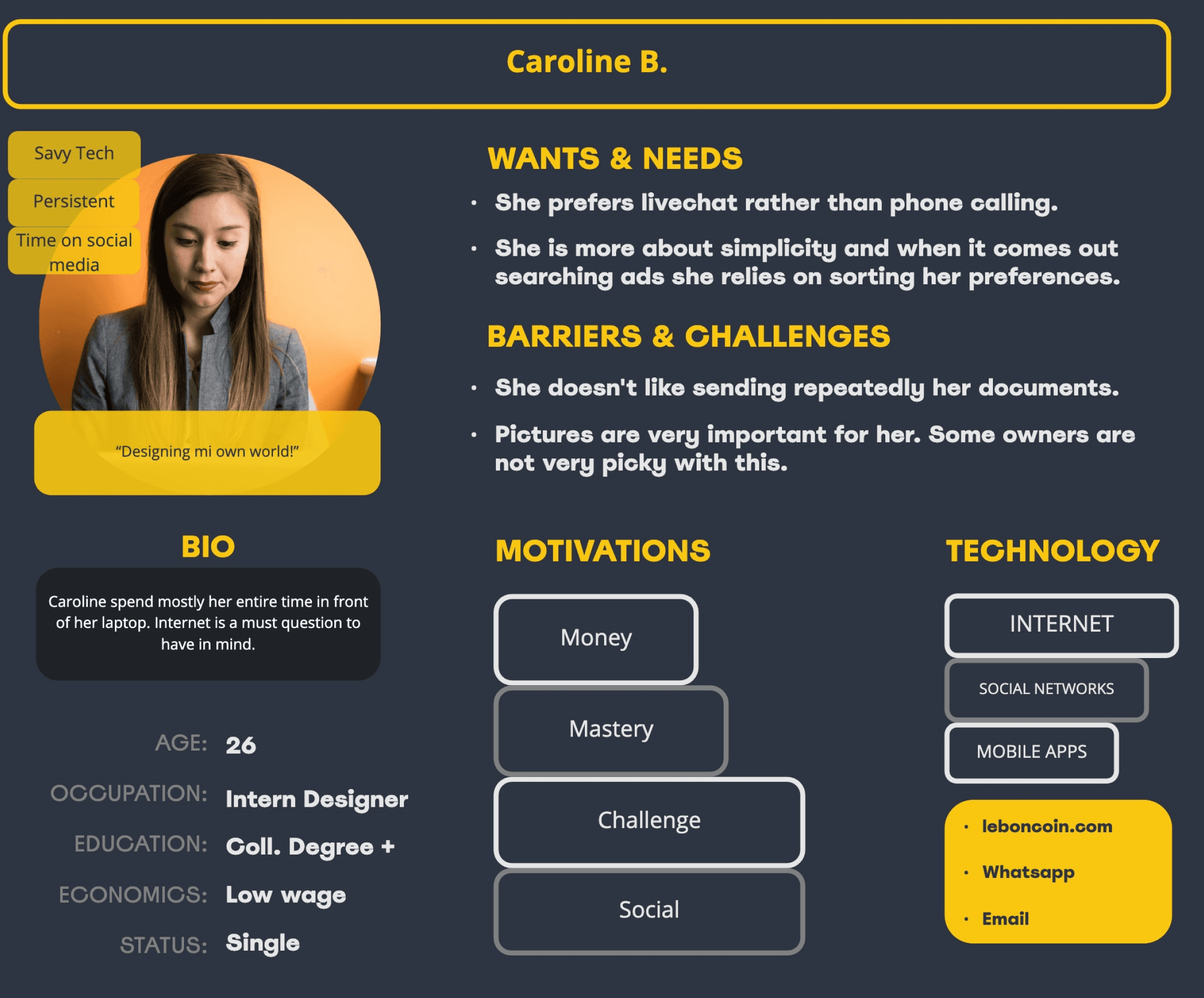

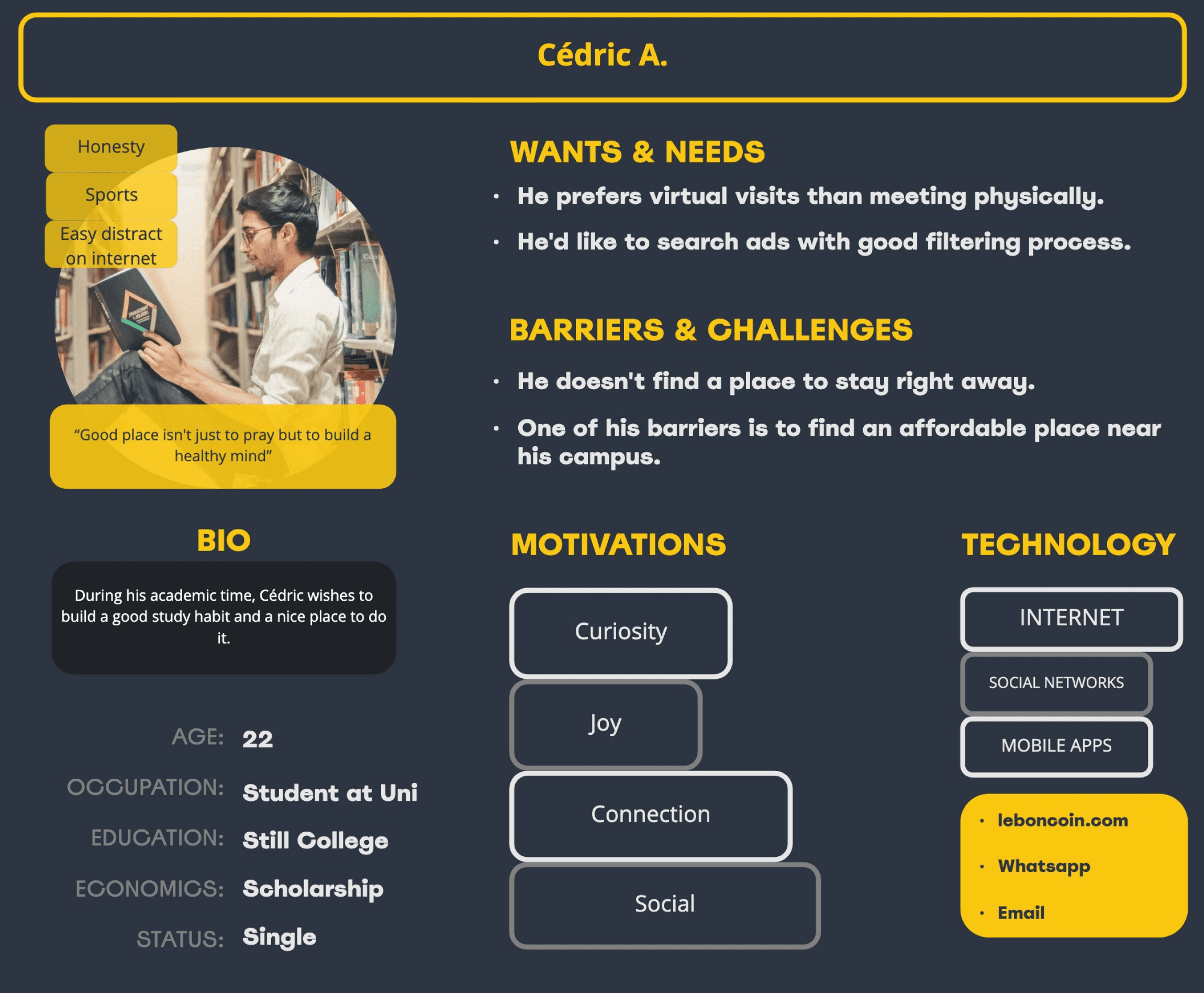
Olgood
Empathize
Define
Ideate
Prototype
Test
journey_Map
This is a visual representation of a user’s journey I’ve set for each group in order to identify touchpoints within the app and improve the exprience.
Cromwell Sanchez
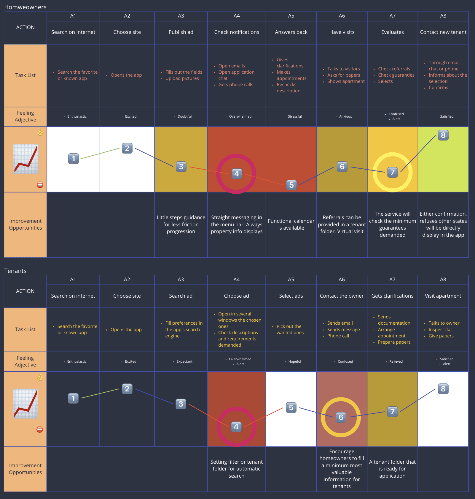
Olgood
Empathize
Define
Ideate
Prototype
Test
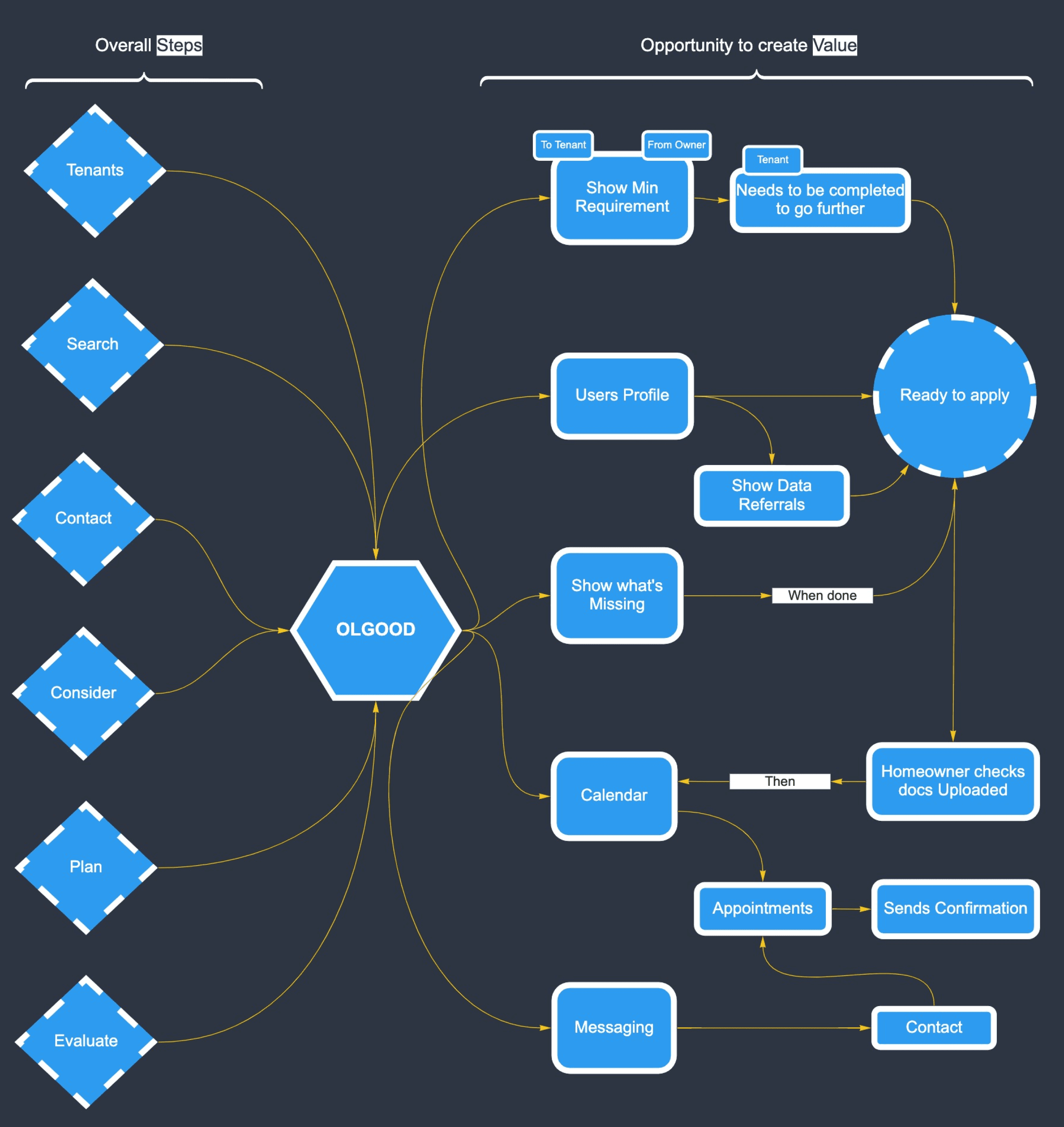
ideate
Brainstorming + HMW
User flow
Workflow
Cromwell Sanchez
Empathize
Define
Ideate
Prototype
Test
Olgood
hmw + Brainstorming_
I’ve brainstormed some ideas to elaborate those user opportunities wa’ve pointed out in the previous phase. Also with the help of the 5 Whys method which has been funneled through the 3 most relevant HMW’s - this last part can be checked here.
Finally, we use a matrix system.
Cromwell Sanchez
Empathize
Define
Ideate
Prototype
Test
Olgood
View full project in Miro


user_Flow
We analyzed other product markets in order to understand if this is a standardized market, favoring Jakob’s law. This is how normally tenants and homeowners behave/ interact each other in those products. This will help us to better define our user navigation through the app.
Cromwell Sanchez
TENANTS
HOMEOWNERS
Search on internet
Choose web
Search Ad
Study the chosen ones
Sends message
Send docs in order to apply
For Clarification
All Good
Positive Feedback
Visit Apartment
Waits Evaluation
Not Have minimum required
Gets clarifications
Phone Calling
Asking for more info
Waits for Appointment
Check Referrals
Negative Feedback
Publish Ad
Initial contact
Evaluation
Planning
Searching
Filtering
Planning
Initial Contact
Evaluation
Receive messages from applicants
People missing appointments
Receive calls
People coming
Asked clarifications
Get confirmations
Check paperwork
Answers back
Make appointments
Evaluates who stays
Olgood
Empathize
Define
Ideate
Prototype
Test
tenant_Flow
Tasks are specific but not the way to get through. That means the user can take different ways in which we will deliver a suggestion - one of the goals - to make a tenant folder. This tenant folder is a way to remove pain points we identified during the research.
owner_Flow
The need of arranging is essential for owners. That counts on scheduling, messaging, etc. The tasks I implemented for them are basically during a request for a visit which they’ll turn it down and re-arrange it. We’ll see how hard or smooth is for the user and the improvement we achieve.
Cromwell Sanchez
Build folder
Send message
Build TF
Build TF
Gets notifs
Wait owner’s confirm
Login/
Create account
Manage rental page
Check notifs
Accept
Accept
Refuse
Refuse
Modify
Modify
Request visit
Login/Create account
Search
Select ad
Search
Create account
Yes
Yes
Yes
Yes
No
No
No
No
Login in
Making directly a TF
Login/Create account
Homepage
Search button
Set preference
Auto search
Notification
Answer
Send a tenant folder
Goal
Steps
Goal
Any of these buttons leads to a single question which demands to the user if she/he wants to:
Gets message
Wait user’s confirmation
Accept
Accept
Refuse
Refuse
Modify
Request visit
Fill out rental form
Create account
Login in
Add rental
Login/Create account
Homepage
Goal
Steps
Gets notification
Empathize
Define
Ideate
Prototype
Test
Olgood
workflow_Map
Tasks are specific but no the way to get through. That means the user can take different ways in which we will deliver a suggestion - one of the goals - to make a tenant folder. This tenant folder is a way to remove pain points we identified during the research.
Cromwell Sanchez
Olgood
Empathize
Define
Ideate
Prototype
Test
Cromwell Sanchez
prototype
Low fidelity wireframe
Hight fidelity wireframe
Mockups
Style guide
Empathize
Define
Ideate
Prototype
Test
Olgood
Empathize
Define
Ideate
Prototype
Test

Blue light mode

Dark mode
Orange light mode

High contrast
Deuteranomaly Blindness
Cromwell Sanchez
homepage
calendar page
ad page
tenant folder
messaging page


homepage
calendar page
ad page
tenant folder
messaging page


homepage
chat
Ad view
messaging
tenant folder
calendar list
desktop_
Mockups
mobile_Mockups
Dark mode


Light mode v2


Light mode v1
I designed for the most general type of blindness - using blue color - and also for users with blurry vision. This will also applied for typogrphy in CTA buttons making text much bigger.
Why?Approximately 253 million people live with vision impairment or are color blind, out of which 36 million are blind, and 217 million have medium to severe vision impairmen. I wanted to integrate those people that have so visual impediments because of their age - such as homeowners could - or simply because they’ve got visual problems from early age. Either both situations are a hint for a wider design.
Different color UI, for different users
Low fidelity
High fidelity & prototype
Olgood


wireframes_
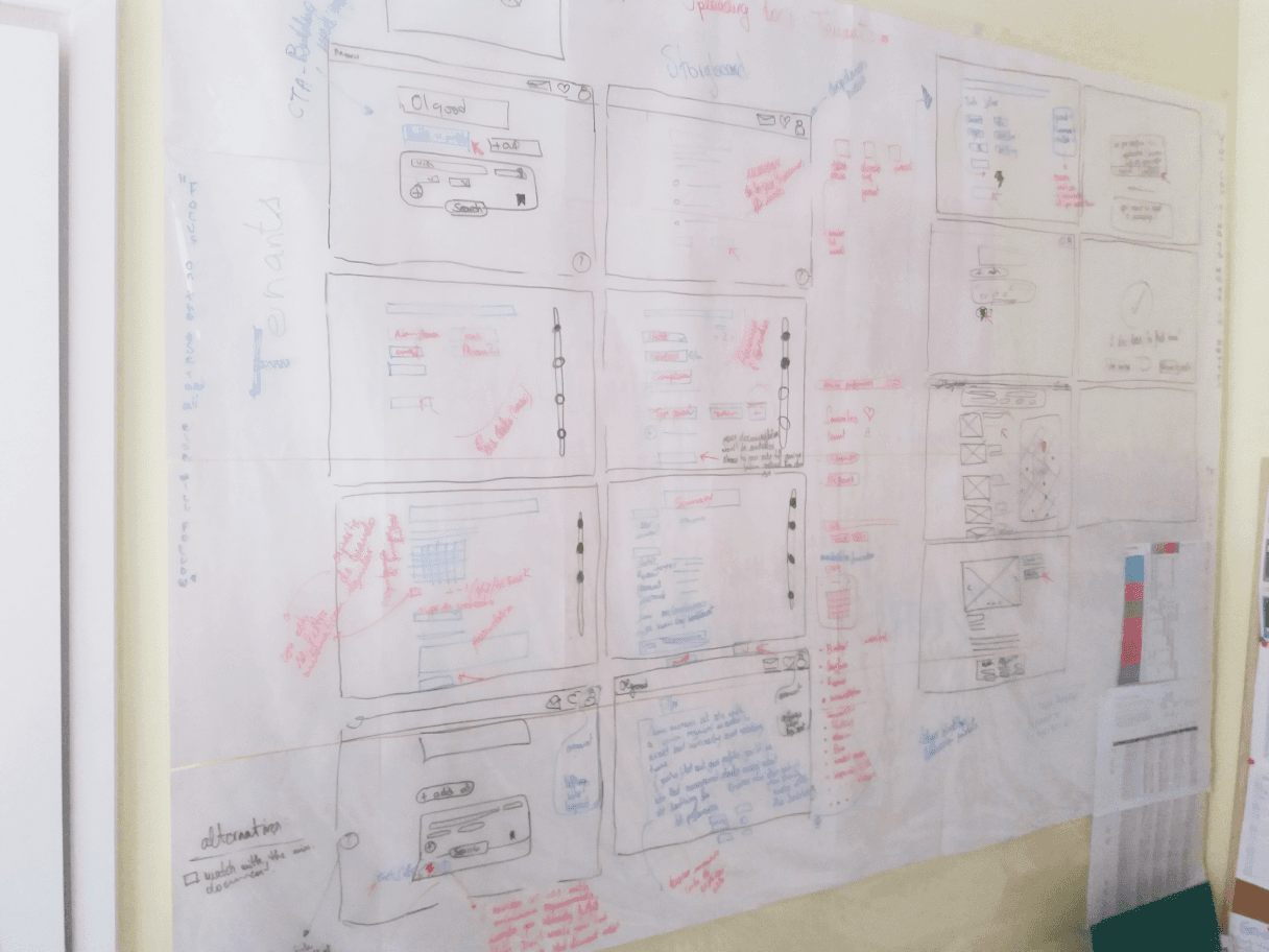
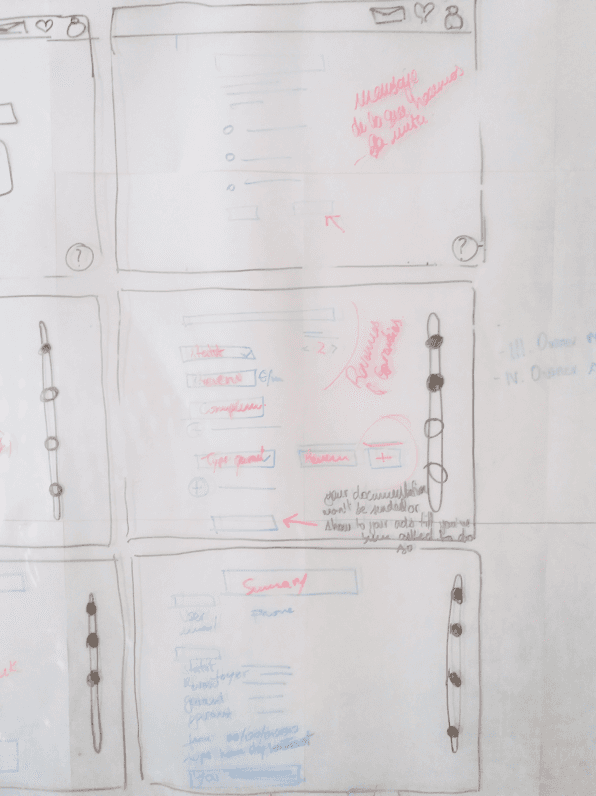
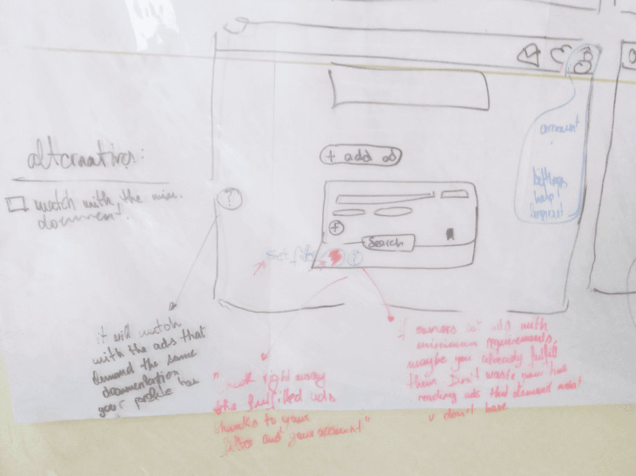
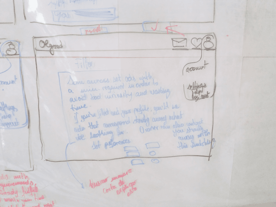
I start designing on a whiteboard in order to capture the essence of those ideas we’ve got in the previous phases. Then, we design them in low fidelity wireframe to just portray the basic structure of our app.
We go eventually beyond the structure and translate those designs with content, semantic color, dimensions and text in a high fidelity wireframe which will be our main placeholder for a protototype.style_Guide
Colors
Type
Circular Std
Means
Heading 1
HeadingB
Means - Light - 64px
Means - Light - 48px
Supporting font
For functional parts.
brand typeface
Primary font for Olgood.
FEB612
Brand primary
145BFA
FF3232
FFAD3A
53D62F
Info
Danger
Warning
Success
Semantic
I used two types of typography, Means as the main type for the app. It’s warmth, gives the modern touch and more personality to the overall text. It comes in handy with the character style of the site. The second typeface is the supportive one, the one who helps in the functional parts and legible as well.
As explained in the mockup section, the user can choose the main style of the website, either because it exists physical problems such as blindness, readability or color liking. However, the primary branding for the app is orange which gives a positive feeling in most cases, warmth and comfort. This is what we want to prioritize when you are in the middle of a search. We kept an analogous color harmonie for the rest of the design.
Cromwell Sanchez
Empathize
Define
Ideate
Prototype
Test
Olgood
TESTING
Usability testing
A/B Testing
Results
Cromwell Sanchez
Olgood
Empathize
Define
Ideate
Prototype
Test
usability_Testing
What did you like/dislike about navigation in general?
If you had a magic wand, what would you change?
How did it go when you filled out the form?
What do you think about it?
What do you think about the part of the form that asks about uploading files (applicants' guarantees)?
I’ve conducted a remote usability test using a high fidelity prototype using Useberry. The tests were written in 3 different languages, getting results from 21 different testers which provide valuable information such as heatmaps, user flow and completion rates. The test was made in two phases for the 2 types of users.
Upload an ad of your flat to the website.
You get a notification. You respond to this request booking a date for a visit.
The booking doesn't suit you anymore, change it for another date.
Return to the initial page.
2) Tasks (Owner user):
Look for an apartment and apply.
Book a visit to see the apartment.
When the visit is fixed, try to change it to another date.
Return to the initial page.
1) Tasks (Tenant user):
Survey:
Cromwell Sanchez
Empathize
Define
Ideate
Prototype
Test
Olgood
a/b_Testing
I made an A/B test to relocate the CTA button - “Add a visit” - since this button has more importance than the average ones.
First of all, “+” icon are very common for most apps with also a common action (add pictures, files, etc).
However, relocation also implies small changes such ‘Button’ vs ‘Icon’. This is because the first location button was in the messaging nav-bar and the second option would be placed in the text message area.
We ask users which button is more intuitive for them.
We give an option for their own suggestions.
Cromwell Sanchez
Empathize
Define
Ideate
Prototype
Test
Olgood


A
B
Cromwell Sanchez
usability & a/b testing_Results
“Add visit” button had to be place differently.
Replace “+ Add visit” icon is confusing.
Change typography.
Overall very intuitive and clear.
Change structure of the form.
Too much information in the ad page.
Change some key words for the form.
Feedback:
Standar calendar icon replaces “+” icon.
A/B testing for “add visit” button location.
Changed typography.
Changed language for the form.
Tenant folder doesn’t interrupt fluidity.
Improvements:
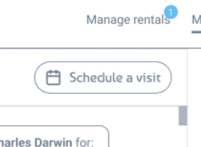
Finally, we concluded placing an icon calendar which while hovering will show a text with a specific word for it: “Schedule a visit”. This will be hardly confuse with the former choice “Add a visit” and highly specific which is what we want for the sake of clarity.
One of the challenges which I had to itirate few times was the tenant folder system, ‘make users to understand the benefits of making a tenant folder’. I had to use different approachs to bring the message strategically without loosing user’s flow and avoiding friction or frustration.
Empathize
Define
Ideate
Prototype
Test
Olgood
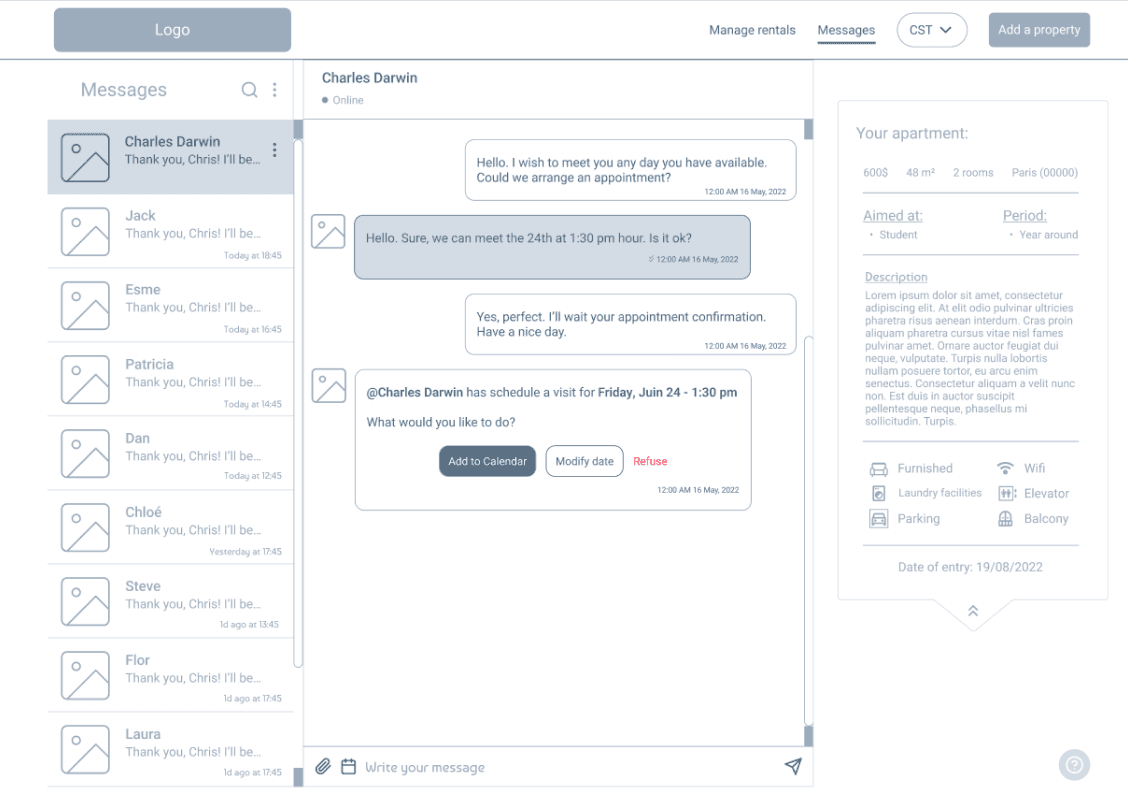
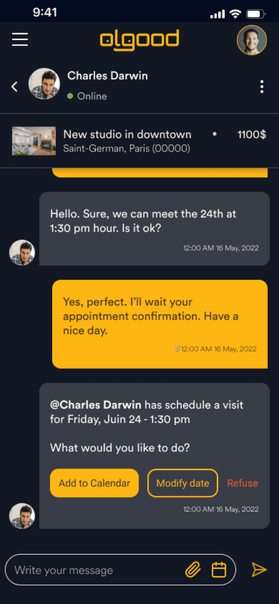
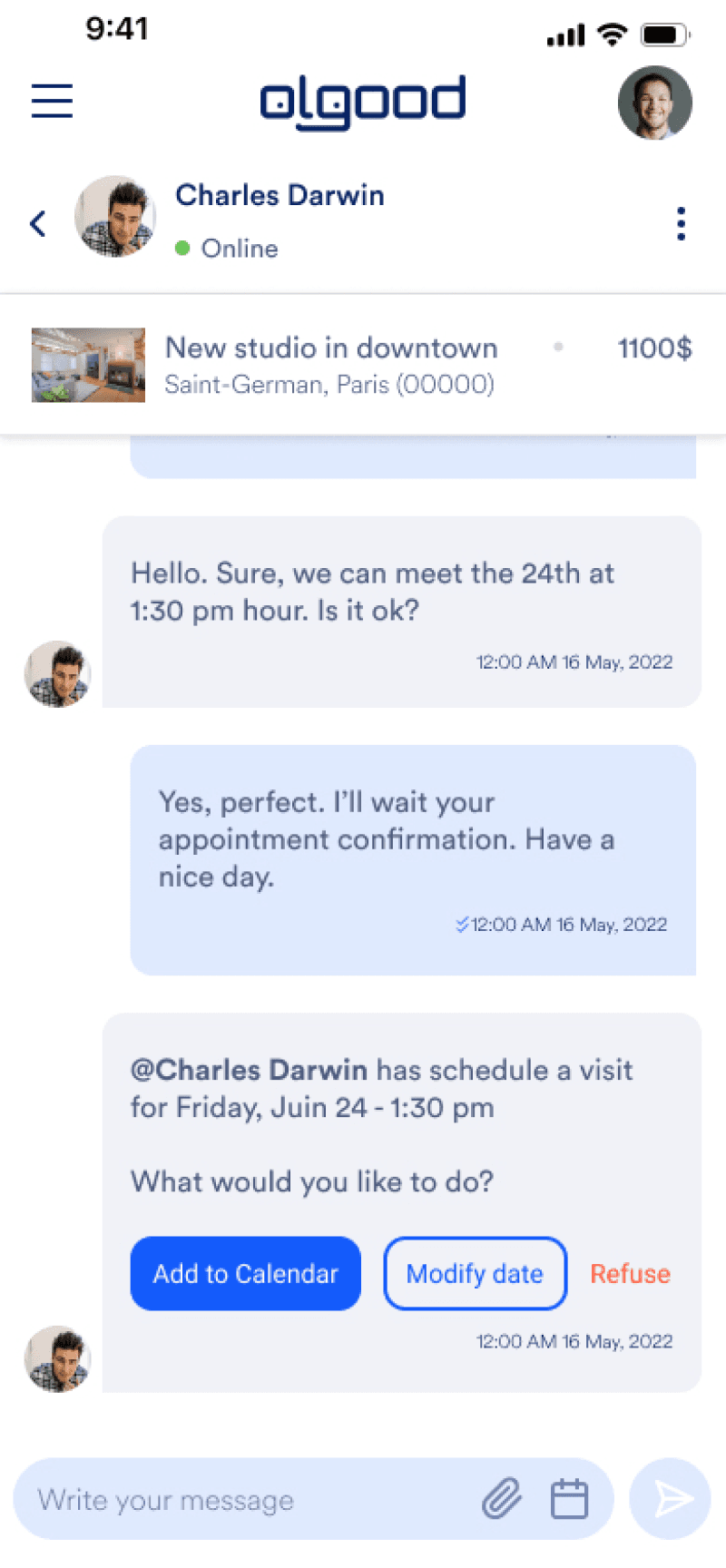
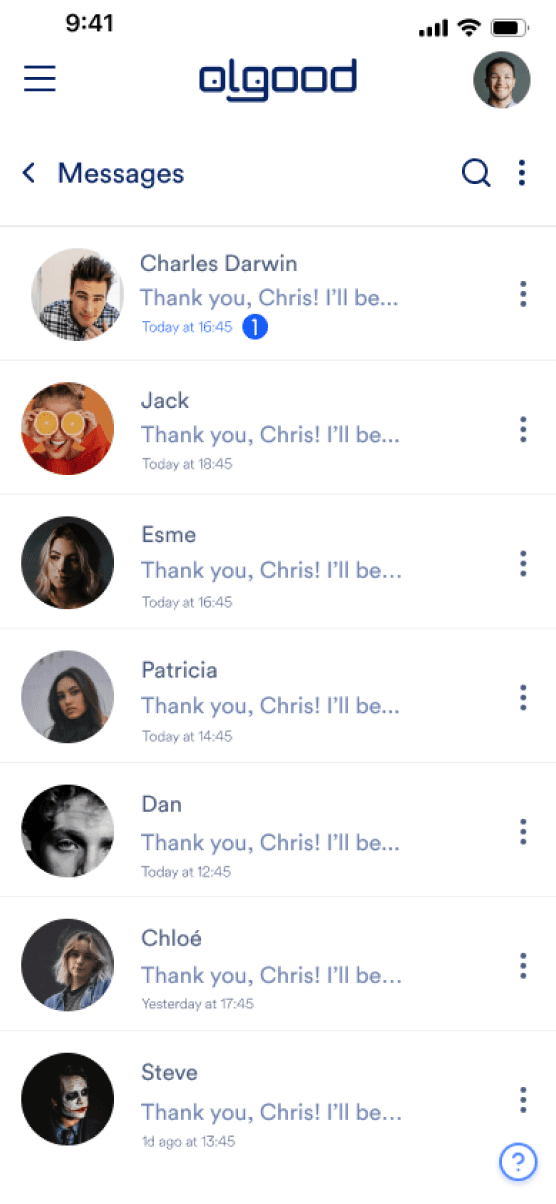
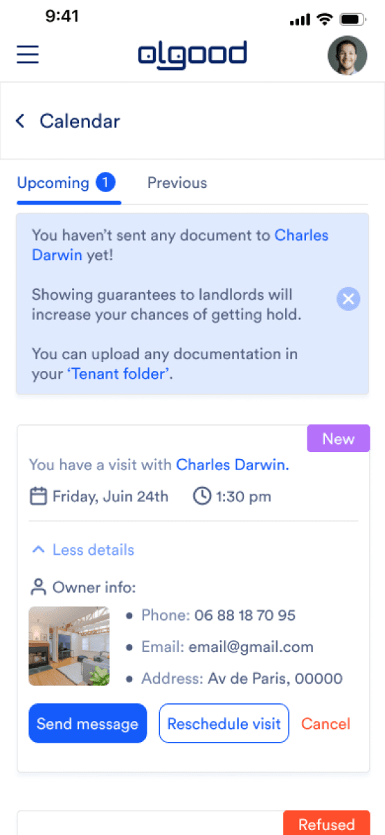
Straight messaging page with extra functionalities such: Schedule visits and confirmation/refuse/modify visits.
Improved search by a formal calendar where the user will select when he/she wishes to move out or when the property will be available so the research will match both.
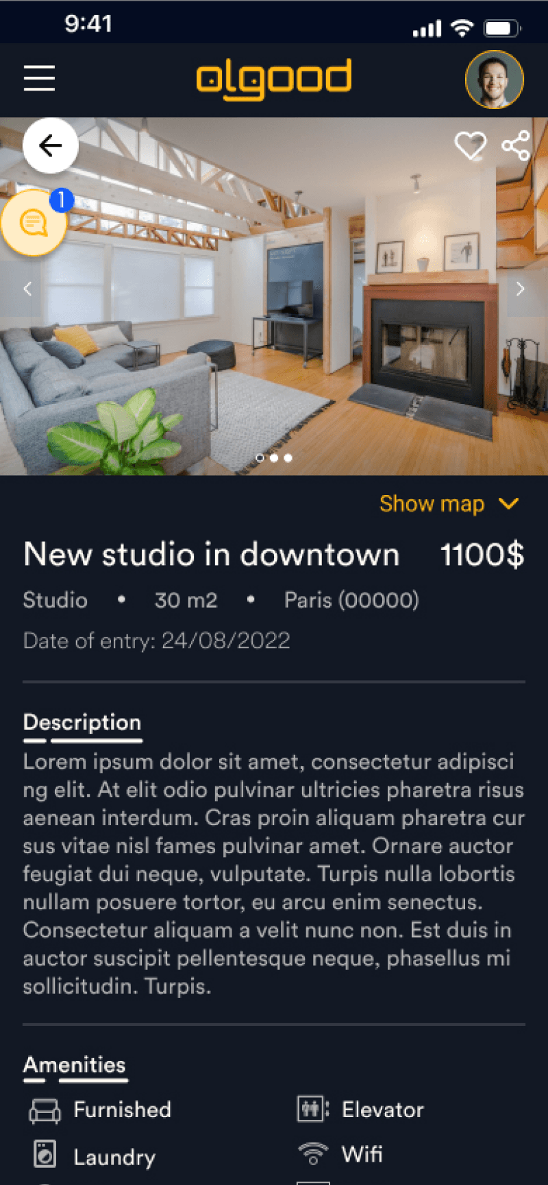
“Show and evaluate” in an easy way. As some owners ask for documentation online and normally through an email account for the admission based on application, those who wish to facilitate this information will be possible in the service. Applicants will optionally add their docs so when they apply an ad, this can be showed after confirmation.
Visits will be arranged with a confirmation selection after the first steps with the application with referrals process. Visits will be arranged still on the app with a calendar and messaging.
Voice and tone for CTA such as: tenant folder creation, pop up messages & so on.
Solution Olgood service updates: